
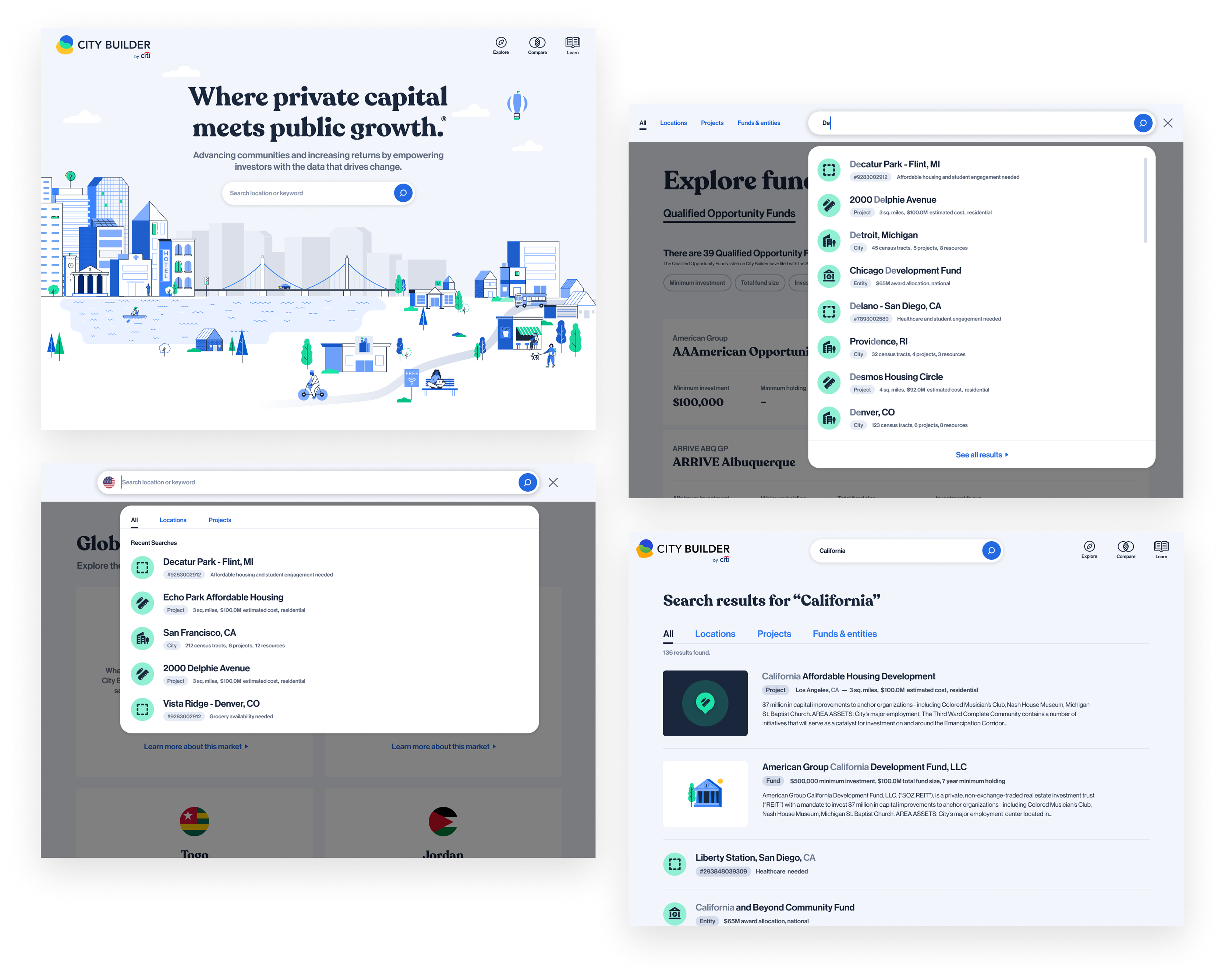

City Builder was created by Citi Ventures Studio to help private equity investors discover investment opportunities that could generate financial returns while supporting underserved communities.
As the platform evolved, search became increasingly important to its value proposition. Investors needed more than a way to locate specific projects. They needed an intuitive way to explore unfamiliar markets, uncover opportunities, and navigate complex investment information.
I led the evolution of the search experience, collaborating with product, engineering, and research teams to create a scalable foundation for the platform's growth.
When I joined the team, City Builder 2.0 was approaching launch, but one of its most important features had yet to be designed.
Search was intended to be the primary entry point on the homepage, making it a critical component of the platform's investment discovery experience.
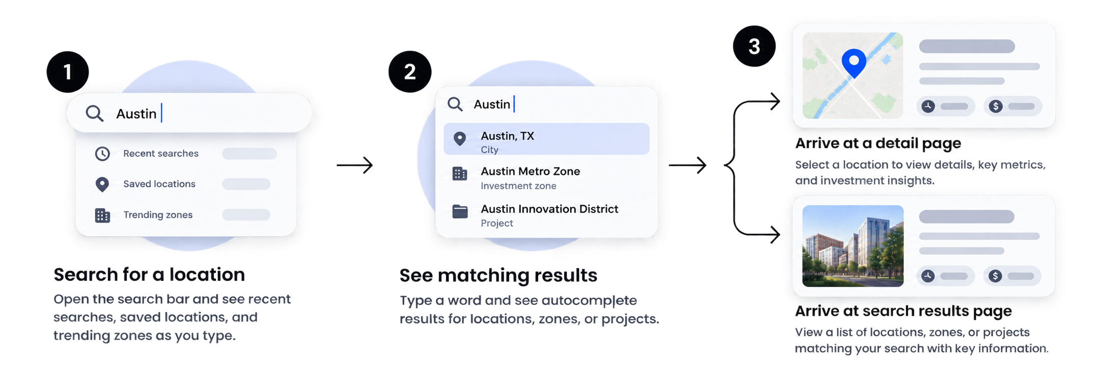
Rather than approaching the challenge as a standalone UI feature, I focused on defining how search could support the broader investment research journey.
Help investors discover relevant opportunities even when they don't know exactly what they're looking for.
Make it easier for investors to narrow their focus and explore opportunities based on their investment interests.
Provide a direct path to specific projects, markets, and information for users who already know what they need.
These principles provided a foundation for evaluating design directions and aligning decisions with the platform's broader goals.
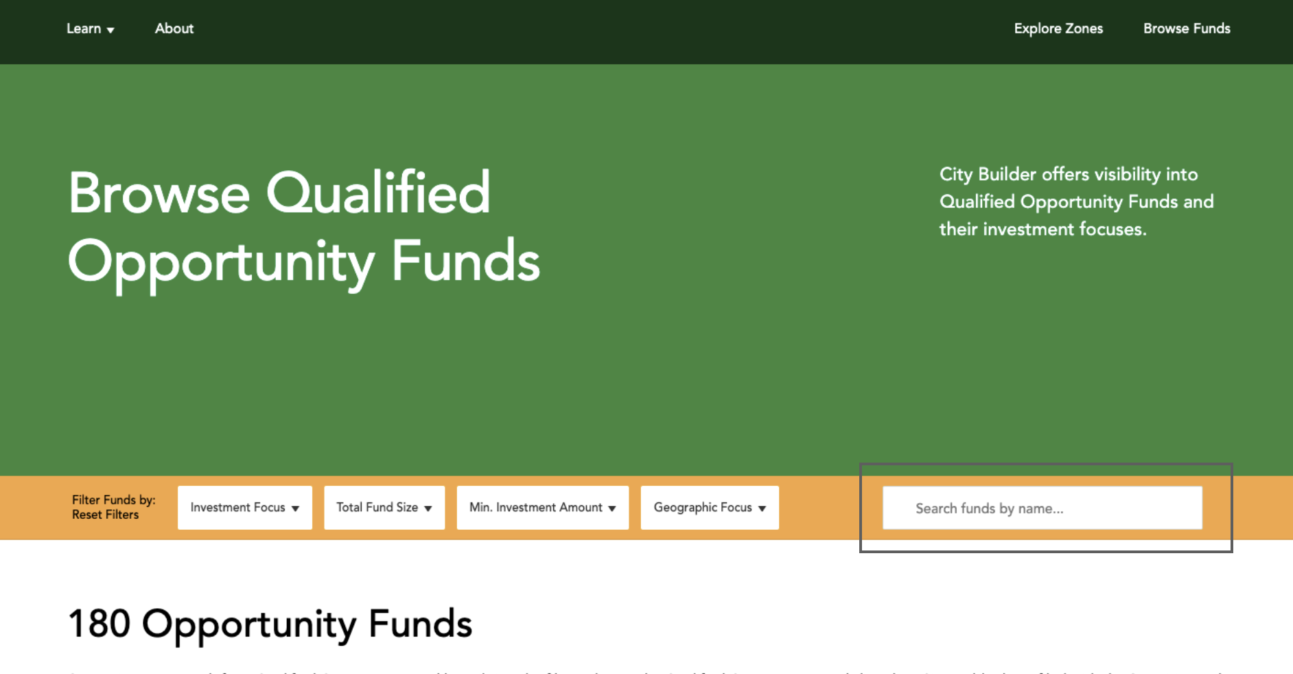
The original MVP included search functionality, but its usefulness was limited.
Search was fragmented across different areas of the platform and relied heavily on users entering precise keywords. This created a fundamental mismatch between how the feature worked and how investors approached research.
Early usability testing revealed that participants struggled to understand how to use search effectively.
The problem extended beyond discoverability. The experience assumed users already knew what information existed and how to find it, limiting its potential as a research tool.
The opportunity was to shift search from a reactive lookup tool to a more flexible discovery experience.
With just one month until launch, I needed to balance the platform's long-term vision with immediate delivery constraints.
I structured the design process around three stages:
Develop distinct interaction models to understand the opportunities and limitations of different search patterns.
Bring product and engineering stakeholders into the decision-making process early to evaluate usability, flexibility, and implementation complexity.
Translate the selected direction into detailed interaction flows, edge cases, motion specifications, and production-ready designs.
This approach allowed us to evaluate the experience strategically before committing engineering resources to a particular solution.
I began by exploring seven distinct concepts, each representing a different approach to search interaction and information discovery.
After an initial design review, I narrowed the exploration to three directions for evaluation with the broader product team.
Rather than focusing solely on visual design, I assessed each concept against the same core considerations: discoverability, information density, interaction consistency, scalability, and engineering effort.

This approach used a conventional dropdown to surface matching results across multiple categories.
Its primary advantage was flexibility. The component could be reused across different pages and screen sizes with relatively little disruption to the existing interface.
The constrained layout limited how much information could be displayed. Broad searches would require users to navigate away from the dropdown to meaningfully explore results, reducing its usefulness as a discovery tool.
This direction introduced a full-screen modal, creating significantly more room for search results, descriptions, and supporting context.
The additional space could potentially eliminate the need for a separate results page.
The interaction introduced a more substantial departure from familiar search patterns. It risked creating confusion about navigation and required the search interface to behave differently from the rest of the platform.

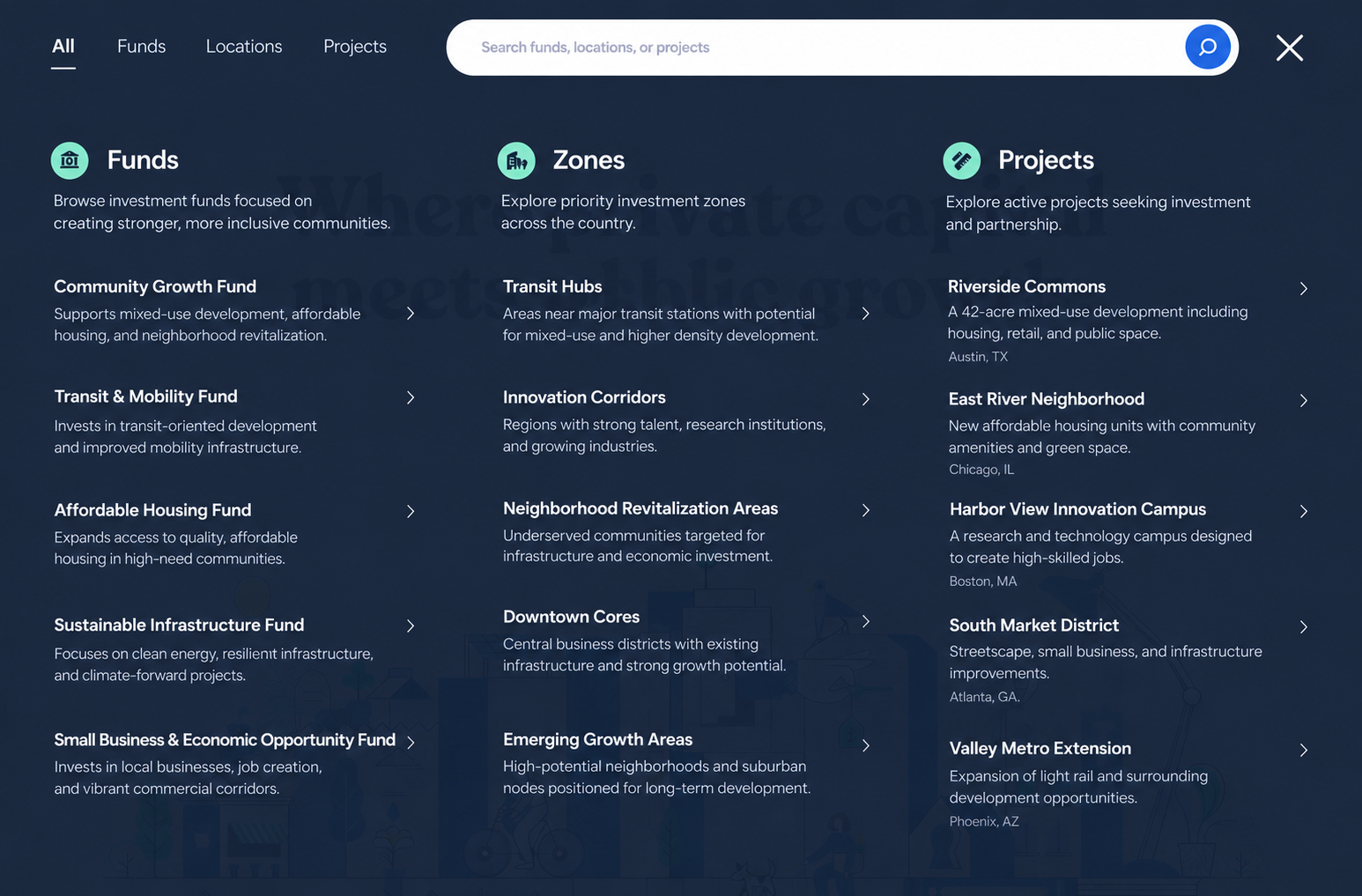
The third concept expanded the search field into a larger, scrollable results panel. It created room for descriptive information, category navigation, and richer results while maintaining the familiarity of an inline search interaction.
The expanded layout introduced challenges around category visibility, dismissal behavior, and maintaining consistency across different page contexts.
Despite these limitations, it offered the strongest foundation for a flexible and scalable search system.
I facilitated a cross-functional review of the concepts with product and engineering to evaluate which approach best supported the platform's goals.
We selected the expandable search model because it provided the strongest balance between discovery, usability, and implementation feasibility.
The decision also established a foundation that could evolve without requiring the entire interaction model to be redesigned as new capabilities were introduced.
One of the most important decisions involved handling broad queries that could return hundreds of results.
We considered introducing pagination directly within the dropdown or building a dedicated results page. Both approaches offered advantages, but fully supporting either within the initial release would have expanded the scope beyond our delivery timeline.
I worked with the team to define a phased approach:
Launch the expandable search interaction with category navigation, relevant results, and consistent behavior across the platform.

Extend the experience with a dedicated results page capable of accommodating larger result sets.
This allowed us to deliver the highest-priority functionality within the initial sprint while preserving a clear path for future enhancements.
Search was positioned as the primary call to action on the homepage, but it also needed to remain accessible throughout the rest of the platform.
This created an important interaction challenge.
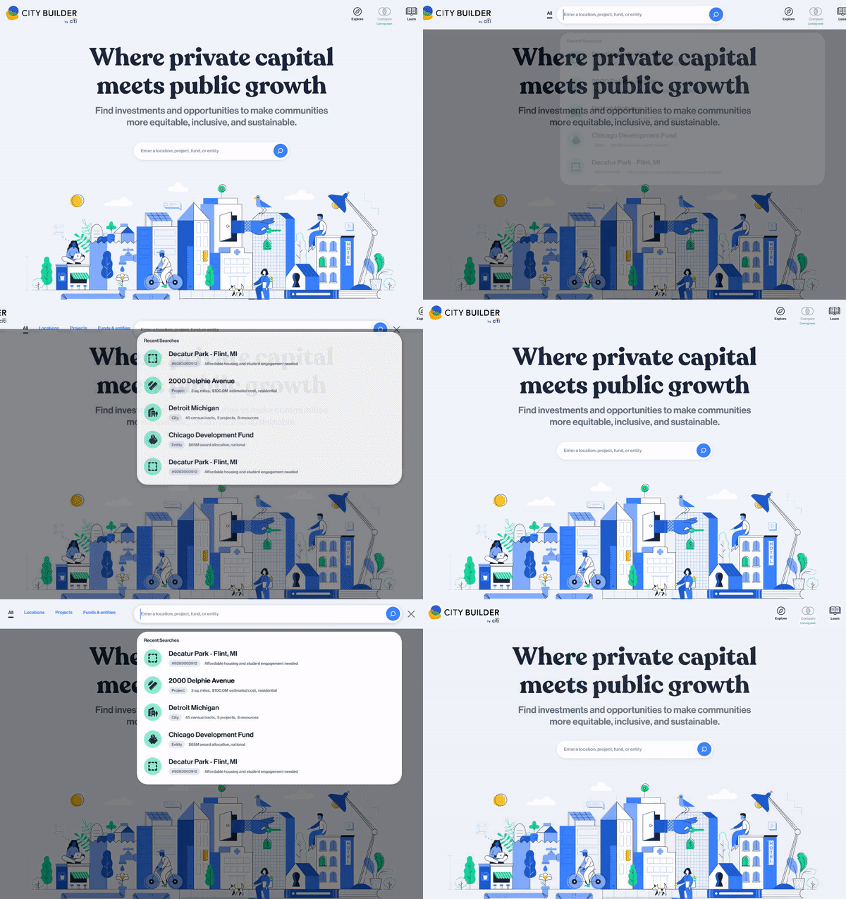
On the homepage, the search field appeared prominently in the center of the screen. On interior pages, it was integrated into the navigation bar.
Building two independent experiences would have introduced unnecessary complexity and created inconsistent behavior for users. Instead, I developed a unified interaction model that adapted to both contexts.
I designed a transition that repositioned the search field from the center of the homepage to the top of the viewport before expanding the results panel.
The animation provided continuity between the initial interaction and the expanded search state, helping users maintain context as the interface changed.
On interior pages, the search field needed to expand within a navigation bar already occupied by branding and navigation controls.
I designed a coordinated transition that moved the surrounding navigation elements out of view as search expanded. This maintained a consistent interaction pattern while accommodating the constraints of the existing layout.

The objective was to use motion to communicate changes in interface state and reduce the cognitive effort required to navigate the experience.
Following the initial search implementation, I extended the experience to address a limitation we had deliberately deferred during the first release: navigating large result sets.
While the expandable search interface worked well for quick discovery, investors needed a way to explore broader queries without being constrained by the dropdown.
I designed a dedicated results page that extended the existing interaction model rather than introducing an entirely separate experience.
The solution introduced a clear "See all results" action within the dropdown, creating a natural progression from quick search to deeper exploration.
The results page preserved familiar category navigation while introducing pagination to support hundreds of matching results.
This approach created two complementary modes of search:
Find relevant opportunities and navigate directly to specific information without leaving the current context.
Browse larger sets of opportunities and compare results across categories within a dedicated research environment.
By maintaining consistent patterns between these experiences, we increased the platform's search capabilities without introducing unnecessary complexity.

As City Builder expanded, the platform began supporting investment opportunities across international markets.
The team partnered with governments in Ukraine, Italy, Togo, and Jordan to showcase projects and attract investment.
This introduced a new product challenge: how could search accommodate different markets, each with its own categories and investment information, without fragmenting the experience?
One option was to create separate versions of City Builder for each market.
However, that approach would have made it more difficult for investors to discover opportunities beyond the regions they were already exploring.
The team aligned on a unified platform that would bring multiple markets together and allow investors to navigate between them.
Supporting multiple markets required us to rethink how users navigated and discovered investment opportunities.
The original search model organized information primarily by category.
With international expansion, users needed to establish their market context before exploring the categories available within that market.
I redesigned the search hierarchy to support this additional layer of navigation.
The updated experience introduced a dedicated market selector within the search field and repositioned category navigation inside the expanded results panel.
This established a clearer relationship between market selection, available categories, and search results. More importantly, the solution created a flexible interaction model that could accommodate additional markets without requiring a new search experience for each one.
What began as a search redesign evolved into a reusable system capable of supporting the platform's international growth.

The redesigned search experience delivered measurable improvements in engagement and established a more scalable foundation for City Builder.
Following implementation of search 2.0 capabilities, search usage increased fourfold.
This represented a meaningful shift in how users engaged with the platform, indicating that search had become a more prominent part of the investment discovery experience.
Following international search launch, the research team conducted usability testing with seven participants.
All seven successfully located specific pages within their intended markets without researcher assistance.
This project reinforced the importance of approaching interface design as a broader product problem.
The most consequential decisions weren't about the appearance of the search field. They involved defining the role search should play in the research journey, evaluating competing solutions, aligning cross-functional priorities, and making deliberate trade-offs between immediate delivery and long-term scalability.
By establishing a clear experience strategy and evolving the solution incrementally, we transformed search into a more valuable and extensible part of City Builder.
